
Responsive Toolbar - Online ecommerce Store Part 1
After learning error handling in our previous demo session Handling Server Side HTTP Error | 0009-27, next we will focus on creating responsive toolbar in our ecommerce store. In today’s world most of the shopping sites are being used on mobile phones, ipads etc., so it’s a must requirement to have a responsive web app which can work properly in mobile devices.
In this video session Responsive Toolbar Online eCommerce Store Part 1 we will learn how to make our website responsive, first will start with toolbar. Currently our web app looks like below:
In order to setup a responsive toolbar, we need to take multiple steps. Each step is explained one by one with screenshots below:
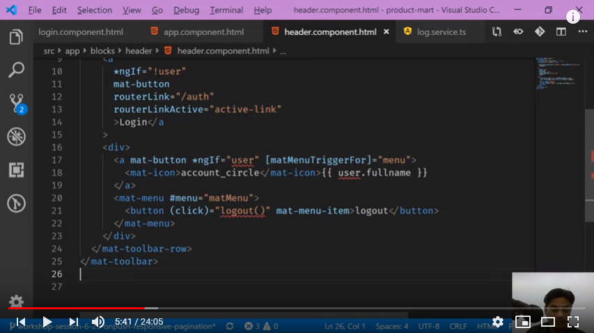
First we will remove existing header part from app.component.html and put it in already created header.component.html.
In second step, we should go ahead and create the input property for user data. There are two ways to do that one is we can get the auth service and we can subscribe in auth service to get user data. However, here we will follow the other strategy in which we will create one smart component and sum of dump components who doesn’t know how to make network call.

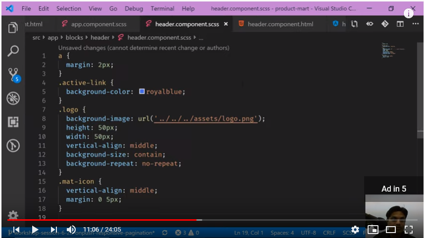
Next step, we need to copy all of the css from app component and put it in header component css. Also in app component we need to pass the user to pm-header tag. However we can notice here in app.component.ts user is not observable. So first we need to make it observable so that it can push the data to header component.

In this way we converted our user to observable and now we can pass it to the header tag in app.component.html.

Also we will make some changes in design part to achieve the required output. All this designing part is discussed in detail in our next video session Responsive Toolbar Online eCommerce Store Part 2 which is in continuity to this session.